Home is just like work after all
It is a shameful reality of the current industrial complex that surrounds science that you cannot always get to your data. This may seem like a silly gripe but it has massive implications to those working everyday on data collection. If I collect some information on a chemical system I want to, more often than not, pull that data out and manipulate, transform or plot that data how I want. Modern instrument manufactures often obfuscate this process and make it hard to not use their proprietary data handling tools. Often with watermarked graphs - for an extra kick in the teeth.
I fight this with my work but I was shocked to find out that the same holds true for my personal data collection devices. In particular my Garmin smart watch.
Current Solutions
For an upcoming post (which I will link here when done) I wanted to compare my heart-rate, pace and distance travelled across various activities. I want to plot these data so I can make sense of my performance. However I was shocked to find that Garmin does not allow for the export of your data in a easy, .csv, format from the Garmin connect portal. Garmin do offer a solution but the generated .csv leaves a lot to be desired. Indeed it’s barely usable.
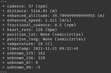
I am not the first to come across this issue, indeed the excellent python package package FitParse will convert Garmin’s super special big boy proprietary data format into something more readable. I did however find that the FitParse team included a rather strange example script which didn’t parse the data in a easily plottable format. The below sample script outputs each recording as it’s own chunk of labelled data. As you can see below. {% highlight python %} #Copied wholesale from https://github.com/dtcooper/python-fitparse for demonstration purposes import fitparse
# Load the FIT file
fitfile = fitparse.FitFile("my_activity.fit")

# Iterate over all messages of type "record"
# (other types include "device_info", "file_creator", "event", etc)
for record in fitfile.get_messages("record"):

    # Records can contain multiple pieces of data (ex: timestamp, latitude, longitude, etc)
    for data in record:

        # Print the name and value of the data (and the units if it has any)
        if data.units:
            print(" * {}: {} ({})".format(data.name, data.value, data.units))
        else:
            print(" * {}: {}".format(data.name, data.value))

    print("---")
{% endhighlight %}
We are getting close but not quite where we want to be. For the reason I offer the following guide and solution for those coming after me. The script and manual are in a Git repository here, feel free to send pull requests if you want to add anything.
The solution
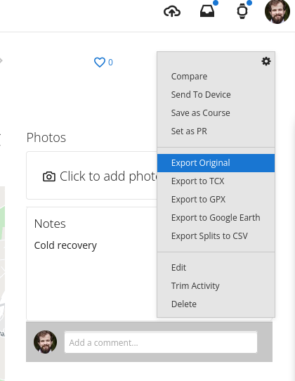
First things first - get a .FIT file. You set this by going to Garmin connect, your activities and selecting an activity - here. Click on an activity and then on the little cog. It’s best to do this on a full desktop/laptop. The mobile website does not give you these options. Click Export Original and this will download a zip file with your activity .FIT file.
You will also need to install FitParse:
pip install fitparse
If you don’t have python set up, that is a little beyond this guide - but have a look at this guide.
If you extract your .FIT file to a folder and rename it as activity.fit and place the following script as script.py in that same folder.
{% highlight python %} import fitparse import pandas as pd # Load the FIT file fitfile = fitparse.FitFile(“activity.fit”)
#Get the headings from the activity file
allHeadings =[]
for record in fitfile.get_messages("record"):
    for data in record:
        k = str(data.name) + ' (' + str(data.units) + ')'
        allHeadings.append(k)
#Removes duplicates from headings
allHeadings = list(dict.fromkeys(allHeadings))


#Here we iterate over the records and format them into columns which are easier to plot.

dictR = {}
df = pd.DataFrame(columns =allHeadings)
for record in fitfile.get_messages("record"):
    for data in record:
        k = str(data.name) + ' (' + str(data.units) + ')'
        v = {k : data.value}
        dictR.update(v)
    df = df.append(dictR, ignore_index=True)


#Creates a column to give activity in seconds
base_dt = df['timestamp (None)'].iloc[0]
df['Elapsed Time (s)'] = (df['timestamp (None)'] - base_dt).dt.total_seconds()


#Export to .CSV
print(df)
df.to_csv('output.csv')
{% endhighlight %}
Then simply run the script - on Linux you would do that by opening a terminal and running the following command:
python script.py
You will now have a .csv file called output.csv which contains all your data as well as a column with elapsed time. Now, you can use this to plot whatever you like!
Close out
So there you have it, your data to do with how you want! Enjoy, go forth and plot!